Knitting requires yarn—colorful yarn. Hand dyed, or better yet, hand-painted by
women in Peru. Arranged in bins, it is ready to be admired whenever the mood
strikes. And gardening, well, you can’t do it without colorful plants and flowers. A
trip to the nursery can feed me for days, especially if I return home with an exotic
morsel of color. Or a whole flat. Colorful tiles, called tesserae, are the tools of
mosaic artists, as are beads and cabochons and all manner of glass do-dads.
Displaying them in transparent jars and bowls is a great way to quicken my pulse
with just a glance. Did I mention my fabric stash?
That brings us to my art supplies. Although I dabble in many mediums, my acrylic
paints are my most used. As one might expect, there is a vast array of colors from
which to choose. But it doesn’t stop there. No, not at all. Always on the lookout for
something new to dip and smear, I’ve discovered paints with previously unimagined
effects. Iridescent, metallic, duochrome, and, my favorite—interference. When it
comes to color, I am polyamorous. Warm, cool, intense, soft, translucent, opaque—I
love them all.
While taking a class at my local art store, the teacher peeked into my open supply
case. “Sam, you have more paint colors than I do, and I own an art store!” I wasn’t
sure if it was a compliment or the beginning of an intervention. Just to be safe, I
quickly closed the lid and changed the subject.
Each label of my favorite paint has a hand-painted swoosh of that particular paint
over three black diagonal lines. Not only can I immediately evaluate the opacity,
texture, and color, I can see how it looks over a white or black background. And the
manufacturer provides free hand-painted color charts of all their paints. The walls
of my studio are adorned with them, along with those I have made with my other
paint and supplies. The abundance of color feeds my soul. It is my palette of
possibilities.
This is what attracts me to my clinical work—imagining all the possibilities.
Unaware that there are other colors to choose from, most folks first enter my
consultation room clutching giant tubes of black and white, which they buy in bulk.
Locked in rigid thinking, they are unaware that there are other options. Our work
together will be focused on expanding their palette. It is important that I introduce
new possibilities in a manner that inspires exploration, without being
overwhelming. It will require both parties to be brave. And I will rely on each
person’s intuition about what speaks to him or her. “But hang on to your black and
white,” I think. “They will come in handy.”
“I love the way you use color,” I told her as we sat at the table waiting for our food to
be served. “Color is about combinations,” she replied. Knowing I was hearing the
wisdom of a master, I scribbled down her words on the napkin in front of me. As an
amateur artist with much to learn, I was thrilled to be at the four-day workshop she
was teaching—Brave Intuitive Painting. The journey would begin the following day.
After a mini lesson on the color wheel and the qualities of translucent and opaque
pigments, we were set free to explore the rainbow. By alternating warm and cool
colors, and letting each layer dry in between, colors would remain fresh and we
would avoid making mud. “There are no mistakes,” she said. “Be brave. Follow
your intuition.”
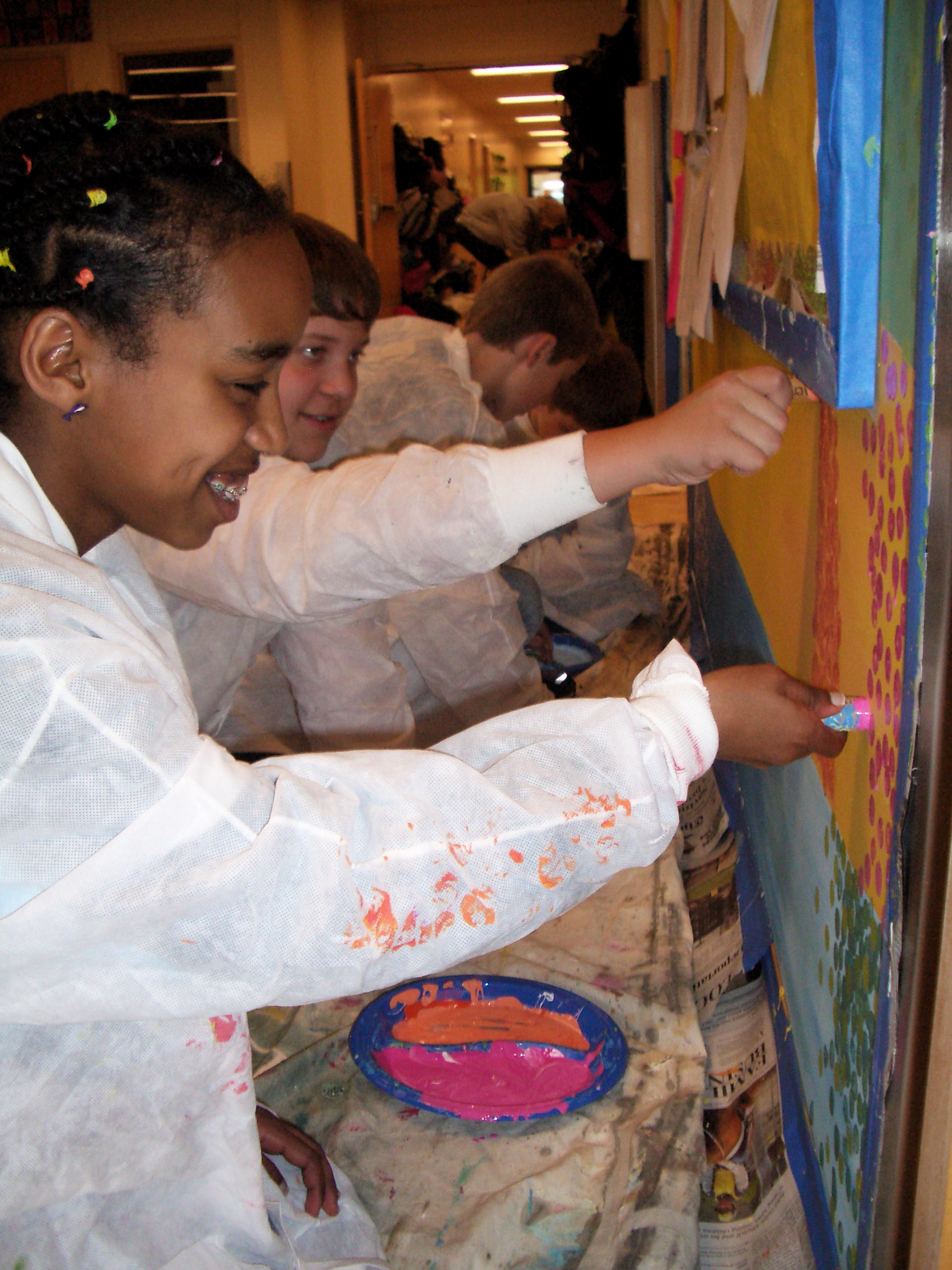
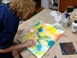
Using my fingers, brushes, rags, and a variety of mark making tools, I dripped,
slathered, and smeared. I did a few layers blindfolded. This playful approach
allowed me to experiment and discover previously unrealized effects and color
combinations. Step by step, I built up rich, textured layers. If I didn’t like something,
I applied new colors on top of the old. It was a liberating and forgiving process. But
after awhile I began to feel overwhelmed with the infinite options. I wasn’t sure
what to do next.
But I did not have to figure it out by myself; my color master was by my side, ready
to guide me. “It’s time to bring more focus to your work. Let’s talk about spiraling
in and spiraling out.” When I stepped back from my canvas, my perspective grew.
Seeing it as a whole got me in touch with what was working and what was not. And
I was better able to see the colors and elements that cooperated and those that
collided. A more focused palette and composition began to emerge. I spiraled in to
develop the areas that spoke to me and rework those that needed attention. Then I
spiraled back out for an expanded perspective. The process continued.
“Let’s get out your black and white,” said my teacher. “You can use them to define
specific areas and add depth. They will make the other colors pop.” She was right,
they did. I had stepped out of the familiar comfort of what I knew and was
rewarded with something richer and more complex than I thought I was capable of.
This is a process that both intrigues and captivates me. It is an honor to accompany
others as they bravely explore the depths of what is possible for them. As we build
the layers together, we both learn more about what it is to be human. Witnessing
others as they open up to new ways of seeing and defining themselves expands my
palette as well. It is a journey for me too, one that leaves me breathless and longing
for more.
