Conflating Gender and Color

Pink is for faers, blue is for zirs

That’s a butchering of neopronouns, which this entry will neither expound upon nor explain further, but i hope it got your attention

A child, maybe two years old, sits for a photograph in 1884. They have shoulder-length hair, which has not yet been cut, a ruffly white dress, patent leather shoes, and are holding a very fun-looking hat. Let not your eyes deceive you because the photograph is one of the earliest of the 32nd US president, Franklin D. Roosevelt(1). Until a certain age, children would wear white because it was easy to bleach. Dresses were practical to accommodate diaper changes. It was common for everything to be adorned with ribbons. At the time, however, children simply weren’t dressed to differentiate boys and girls. Kids were, and still are, just kids.

A normal, cutiepie boy c.1884

By medical happenstance, I grew up in a world surrounded by shades of blue. My parents were more progressive than some, so I wasn’t forced to exclusively wear or display this single color(2). Regardless, it proved impossible to navigate a life of unhappily assigned male-ness without associating it with the long history of masculinity that came before me. But if young men even just one hundred years ago generally wore white dresses, how vast could that history really be?

Not very, it turns out. Pastel shades started to become popular for children in the early 1900s(3), but it wasn’t until the 1940s that manufacturers and advertisers decided on our modern concept of blue for boys and pink for girls and pushed for normalization. The baby boomers are the first generation who grew up dressed like their mothers and fathers in pinks and blues. Coincidentally, it’s harder to pass down clothing from an older sibling to a younger one if they have mismatched gender assignments; parents would simply have to buy more things for their kids to fit in. 

My last entry was a quick dive into the color blue, which spawned the idea for this follow-up, but there’s too much to say about pink to fit into the remaining half of this post. Suffice to say, pink has a history with humanity that stretches as far back as our relationship with red. It wasn’t used to describe the color we recognize now until the very late 1700s(4), but it’s been popularized by everything from swirling scenes of opera and cabaret(5) to aristocratic mistresses(6), concentration camp victims to human rights movements(7), and punk rock aesthetic(8) to pussy-hatted protesters. 

So much PINK! It still blows my mind that the Rocky Horror Picture Show was made in 1975. Was it low budget? Yes. Did actual people still spend actual money to make this ridiculous movie almost fifty years ago? Also yes!

With all that’s changed in our perception of the meaning of color and the various forces of influence behind it all, it begs the question: is it bad that blue is for boys and pink is for girls? This may come as a shock to some who know me, but my answer is no(9). 

People seem to want group identity and seek acceptance within their chosen groups. It seems natural to follow that groups become associated with symbols, colors, flags, songs, and more to differentiate themselves. If you look at the LGBTQ+ pride movements, you’ll see a truly remarkable variety of colors used to denote broad and specific identities(10) or even as code to signal others in the know. I think it’s wrong to try and remove people’s innate sense of healthy group identity; whatever that group has chosen to assume as their symbols is theirs. I do, however, believe the trouble comes up when groups are intended to cause harm and  take away from others or when group identity is forced, rather than treated as an opportunity for exploration(11). Our shared delusion that blue is for boys and pink is for girls is harmless, or even empowering, so long as the conflation between color and gender is optional for everyone regardless of age.

(1) I’ll come out and say it, he was a very adorable kid in his dress.

(2) In actuality, I played dress-up a lot as a kid. My sister and I had an extensive variety of weird costumes, having been blessed in the 90s with a seamstress grandma. Stuff like this is pretty wildly good for kids to express and experiment outside the realm of cultural norms!

(3) As per an American trade magazine in 1918: ““The generally accepted rule is pink for the boys, and blue for the girls. The reason is that pink, being a more decided and stronger color, is more suitable for the boy, while blue, which is more delicate and dainty, is prettier for the girl.” Earnshaw's Infants' Department

(4) The word comes to us from the Dianthus plant, which is commonly referred to as a “Pink.” There are references from as far back as the 1600s to objects being “pink-coloured,” but the English language had previously relied on a few other words. Namely, incarnation, or in reference to the body of Christ as a literal flesh tone. I doubt Europeans in the 1700s were particularly focused on increasing their wokeness, but personally I’m glad the language has moved away from describing this common color as associated with a somehow inexplicably white Jesus. Not everyone looks like that.

(5) Opera Pink is one of my favorite colors and was made very dear to me by someone who used to work at ARTspot with me back in, like, 2015 or something. He was (and I think still is) fabulous, and the colors he liked were equally vibrant. This particular pink (PR 122 for those cool babes in the know) is sometimes criticized for its lightfastness and is supplanted by Permanent Rose (PV19 ew gross), which weirdly has less of a violet bias in a few lines of paint and is less fabulous.

(6) I’m talking about Madame de Pompadour, the official mistress of King Louis the 15th in France c.1750. You can try, but you’ll never be as cool as she was.

(7) Apparently the footnotes are all going to be about history for this entry. I honestly don’t know how many people outside of the affected communities realize this, but the Holocaust extended its remarkably horrifying umbrella over communities of gay and trans people as well as so many others marked as undesirable or a threat to the social order. They applied a label of a pink triangle to identify gay and bisexual men as well as trans women, which was later (and still is) reclaimed by liberation groups in Germany and then beyond. One of my favorite things in the world of media is its inclusion in one of Dr. Frank-N-Furter’s costumes in the Rocky Horror Picture Show (performed LIVE this upcoming Saturday the 4th at the Downtown Seattle Regal Cinema by the Vicarious Theater Company, including yours truly!). I’m very not sorry to be a threat to a social order that would prefer to erase delightful people like myself.

(8) I didn’t quite put this together until I was decorating my roller skates with POSCA markers. I was drawing out the Sex Pistols logo, which has lots of pink, and started noticing it came up pretty often in a lot of punk design. All the weird leftover crustpunks I made friends with in Hackney back in 2016 insisted that the only two colors are red and black. They’re great colors, don’t get me wrong, but a bright, obnoxious pink is such a good tool in the arsenal of anarchy. It’s very hard to ignore!

(9) I have a lot more thoughts about this that wouldn’t easily fit into a 600 word chunk of writing. Obviously the world and the problems therein are much more complicated than a simple yes or no binary. My reasoning in the following paragraph is brief, but I hope it resonates with some looking to claim or reclaim their masculinity in a healthy way; I know it’s something I balance on an everyday basis. In the same sense, these sorts of social systems can be very harmful to some who are trapped in them. To anyone who finds themselves in that boat, I’m very sorry and I hope you’re able to navigate your way out through your own competence and the good intentions of those you surround yourself with. I love you, and it will get better.

(10) Yes, even blue and pink. They show up in the flags for transgender pride as well as those of Demiboys and Demigirls and Lesbians as signifiers of “boy-ness,” and “girl-ness.”

(11) I hope this brief qualification helps to reinforce my earlier point. Please always continue questioning your communities regardless of whether they’re chosen or if you’ve been thrust into them. I no longer really attend, but the church I was raised in was very big on questioning authority, including its own. I’m really very glad to have seen that value demonstrated when I was a kid. No institution or social grouping is so perfect as to justify making life a worse experience for others. Those of us who have benefited from these systems have an obligation to apply those benefits for universal equity to achieve equality.
Monday Blues

What’s the deal with blue?

This color is everywhere, but where does it come from? What’s our relationship to the color blue?

A book I distinctly remember growing up is Gathering Blue by Lois Lowry. It’s part of a series of related stories(1) aimed at young people and focused on a young protagonist who learns the skills of embroidery and dyeing. A notable aspect to the story is how impossible it is to find, make, and use the color blue in her craft(2). 

Blue represents something intangible to us. The sea and sky, equally sublime(3) and both blue through a trick of the light scattering but holds no pigment of its own. Where does all the blue(4) come from?

The Aegean Sea. Homer described the crossing to Troy from the Greek mainland as a wine-dark sea. A dubious fact I once heard is that people from way back when didn’t have a good word for blue, hence the wine-darkness, but also he was just describing what was probably a pretty dark and stormy sea.

As a vast oversimplification, our eyeballs see visible light either directly emitted from a source, scattered or filtered between the source and our eyes, or by reflecting off a surface that itself absorbs some of the other perceptible colors. Some stars emit blue light by their particular fusion process, and there are molecules that filter light to appear blue as it passes through them(5). The next time you’re walking around outside, keep an eye open for the color blue coming or reflecting from a purely natural source(6). We’re surrounded by a panoply of pigments so dense and varied that it’s hard to remember they’re there, but all these pigments have to come from somewhere. Where does all the blue come from??

Pigments have been made for many thousands of years from the earth. Browns, reds and yellows can be taken directly from the ground(7). Others can be taken from the plants and animals around us and processed into usable dyes. These are more vivid greens, reds, and yellows but these colors still all come from somewhat obvious sources(8). Usable blue is harder to come by. When you do it can present a number of issues.

Ultramarine blue has been a staple in western art for hundreds of years, but the imported lapis lazuli needed for it made the pigment worth its weight in gold or more(9). Dye created from woad, which grew throughout Europe, were rare to come by in the quantities needed(10), and cobalt is a heavy metal that’s dangerous to be repeatedly exposed to(11). Indigo, though much more potent than woad and easier to grow in warm climates, didn’t become common in the west until the age of colonization. The human spirit, indomitable as it is in its creative drive, decided to make what it couldn’t find.

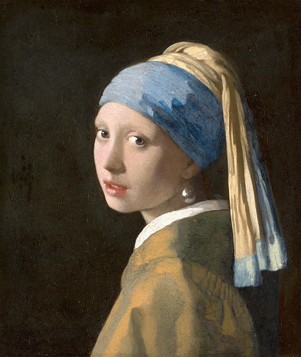
Girl with a Pearl Earring (1665) Johannes Vermeer. Also a movie I remember watching MANY times with my mom growing up.

The first synthetic blue pigment was created by Egyptians over 3000 years ago(12). The combination of sand, copper, and calcium create a blue glass that, when ground, becomes a pigment that is incredibly stable(13). Later, when western science began to rediscover and build on knowledge of chemistry that’d been lost, the variety of synthetic pigments exploded(14). In a post industrial-scientific revolution world, we’re surrounded by a plethora of vibrant colors, and yes, even blues(15). The vibrancy of the world we’ve surrounded ourselves with is so commonplace that it’s hard to imagine a world with less. 

In the plentiful downtime at the start of the Covid-19 pandemic, I took it upon myself to learn as much as I could about pigments and the science behind them as possible without having to pay anything. This turned out to be a surprising amount seeing as much of this science was deeply explored in the 1800s when a hot new color and a few textile mills was all a guy needed to make it big in the British Empire. Whenever you come by the store, please please cut me off whenever you’re done hearing about pigments, especially blues, because I can, and will, just keep going and going.

  1.  Including The Giver and Messenger, these were some pretty dark, dystopian books about a future that was both grim and repressive but also somehow beautiful? I remember thinking they seemed a bit heavy for kids, but life’s heavy. They touch on themes of community, friendship, and small acts of civic disobedience making a big difference bit by bit.

  2.  Before reading a synopsis for this book while researching this post, I remembered the plot being entirely centered around finding a usable blue pigment like a full-on Dungeons & Dragons quest, but I seem to have forgotten all the far more interesting parts of the book. I feel like I probably ought to give this one a re-read!

  3.  I have a very amateur, hobby-level interest in societies from the past (a minor in archaeology), and it’s an interesting point of comparison to see what beings, objects, or other forces people have assigned religious significance to. The sea and the sky both tend to feature prominently among pantheons, and I don’t blame people. They are both huge, always changing, dangerous, and above all beautiful. I learned what the word sublime meant by definition just a few years ago when I was figuring out some very big things about myself and realized I wanted to settle to be nothing less.

  4.  I’m blue, Da ba dee da ba di, Da ba dee da ba di, Da ba dee da ba di, Da ba dee da ba di, Da ba dee da ba di, Da ba dee da ba di, Da ba dee da ba di

  5. When I was going through theater school for costume design, I was required to take a beginning lighting design class because the qualities of light bouncing off your costumes affects how they’re seen. Huge surprise, right?  Anyways by the internal machinations of the university I actually ended up in a 400-level lighting class with four graduating seniors in their field, and I learned a lot that I still use every day. It goes to show that if you aim higher than your station, even if by accident, you stand to gain a lot.

  6. George Carlin did a really great standup bit, Where’s all the Blue Food, that illustrates this point nicely. I don’t know exactly how I feel about George Carlin, and honestly he was a bit before my time, but I do admire some of his statements condemning comedy that “punches down.”

  7. If you haven’t seen pictures of the Lascaux Cave Paintings, look now. Or better yet, visit just east of Bordeaux where they’ve built an exact replica of the cave and its art you can walk around in without worry of damaging the irreplaceable archaeological site!

  8.  I could probably do a very interesting blog post on the difference between dyes and pigments. I promise you’ll be absolutely riveted.

  9. The Dutch painter Johannes Vermeer was allegedly so enamored with ultramarine blue that it drove him and his family into poverty. The opinion of this much-removed writer thinks that masterworks like Girl with a Pearl Earring and The Milkmaid were worth it as representations of less aristocratic people and an inversion of norms regarding the use of the color blue. Because of its high price and rarity, blue in paintings was generally reserved for depictions of the Virgin Mary. That’s one reason why for centuries blue was associated with femininity until at some point we decided that blue was totally macho. I could probably write another blog post just about blue and pink and how silly it all is.

  10. This is the stuff we see Mel Gibson painted up with in Braveheart. Although it was grown all over Europe, woad was allegedly used by the Brigantes of ancient Britain because of blue’s association with a Celtic war goddess. That might also have just been weird Roman propaganda about the spooky, ooky barbarians, so who knows.

  11. The cobalt mines of Germany were so deadly even without considering the long term impact of regular handling of heavy metals that stories began to circulate of evil creatures laying traps and killing the miners. These kobolds are mostly around these days for level 1 adventurers to beat up in Dungeons & Dragons.

  12. Progress is not linear.

  13.  Blue pigments tend to be stable compared to reds, oranges, and yellows because the blue molecules reflect light of a blue wavelength, which is higher energy than the red light at the other end of the visible spectrum. Higher energy light/radiation can blast apart molecules, so reds especially tend to have bigger issues with lightfastness.

  14. Unfortunately my favorite pigment story doesn’t concern the color blue. In 1856 an eighteen year-old British chemist who was experimenting with a cheaper way to synthesize quinine, a treatment for malaria and integral to colonial efforts deeper into the African continent in particular, accidentally discovered the first synthetic purple dye. This made him extraordinarily rich.

  15.  My second favorite pigment story is from 2009 when researchers from Oregon State University accidentally developed a new blue pigment for the first time in almost 200 years. YInMn Blue, named after the Yttrium, Indium, and Manganese atoms that make it up, is an incredibly boring name and a great reason why creative people should continue getting involved in the sciences! Because of the complex elements that go into YInMn Blue, it’s very expensive despite it being kind of commercially available. We don’t have any for sale at ARTspot, but we do have a swatch that a very cool and kind customer let me make from a 1/4oz of this new blue that cost them $40.

Pencils Have No Right to be as Cool as They Are

What even is graphite?

Where did it come from? What do we do with it now that it’s here?


Pencils are ubiquitous in the arts for good reason

Where did they all come from??

I doubt I’ve ever met someone who has never held a bright yellow, No.2 pencil. Probably a Ticonderoga, named after a spot in New York where graphite was processed back in the day. The graphite came from Lead Mountain in Maine(1), but there’s no elemental lead to be found anywhere in a pencil(2). But the Ticonderoga pencils mostly come from Mexico(3) now, and it’s a lot of information and we haven’t even started talking about war yet. And what does any of this actually have to do with lead?


So let’s roll back to answer this lead question. Way back to when information was even more muddled and less reliable than today. There’s some accounts(4) that in Roman times, scribes would use a stylus made of lead to make various marks. However, historians of the time were less interested in the mundanities of everyday life and bureaucracy than they were in military and political epics. What I consider to be a somewhat more credible source comes from the 1500s in England. After a storm, some folks happened upon strange, dark material clinging to the roots of a fallen tree. The material was initially misidentified as lead(5), but in fact the tree had grown atop the largest, purest deposit of graphite ever found. England was first in the European pencil-making business completely by accident.


Pencils rock. You can do practically anything with them worth doing, and their utility as both writing and artistic instruments were quickly apparent. My classmates joked in middle school that NASA had spent millions to develop a pen that would work in zero gravity whereas the Kosmonauts simply used a pencil to record information(6). As graphite became more widely available, pencils outperformed the various metalpoint art techniques(7) that had been practiced for centuries in Europe.

Do not run around with sharpened pencils. A portrait of Nicolaus-Jacque (1755-1805)


So now we come to war, blockades, and a mostly-unsuccessful balloonist named Conté(8). In the midst of the Napoleonic Wars in the late 1700s and early 1800s, Britain was less interested in trading their super pure and excellent graphite with their continental rival. You know how math teachers won’t accept work unless it’s in pencil because only a madman works in ink? It’s the same idea. The necessity to turn in their math homework and anti-British artillery calculations drove Nicolas-Jacques Conté to mix more widely available graphite powder with clay and water(9). This could be dried in a kiln, encased in wood for strength, and became the model for our modern concept of a pencil. A similar method was in use by Joseph Hardmuth and the Koh-I-Noor company, who patented the process and developed the grading system of H’s and B’s we still use today(10). Companies like Hardmuth, Conté, and Derwent all date back to around this period and are still in existence today!


I always tell people that almost every other kind of visual art is built atop drawing skills(11). Working with pencils may not be as sexy as jumping straight to painting or pastels, but I can guarantee it’s hard to find a good drawing pencil for more than four dollars(12). It’s nearly impossible to find paints, brushes, and an appropriate working surface for anything close to that. Coincidentally, any of the great painters I know are also brilliant with a pencil. In the field of art where technique and style are developed through repetition(13), it pays not to spend a fortune developing your fundamental skills. Besides, how could anyone say that a pencil is anything less than extraordinary?


(1)  Or maybe somewhere in Massachusetts? I wasn’t really expecting to have my research in the history of graphite pencil production to feel more like I was researching the enigmatic roots of a mythology. Maybe I’m the weird one for thinking pencil-history is cool enough to be worth it, and if you think that’s the case then maybe skip this blog.

(2) Thank goodness, honestly. I found some sources that lead may have been present in some pencils until as late as when consumer lead use was mostly banned in the US (1978). While I don’t support lead poisoning for babies, artists do genuinely miss lead white. If we can have it back, we promise to not put paintings in our mouths and not use it on walls and toys.

(3)  I don’t intend to bad-talk Mexican production. Dixon-Ticonderoga pencils are perfectly average, and really I’m mostly salty about Prismacolor’s drop in quality after outsourcing production to any factory with reduced tests of quality.

(4) Or no citable accounts insofar as I could find. People write about it but never conclusively.  I do love a good historical anecdote though, especially if it confirms what I already think I know.

(5) To be honest, my knowledge of chemistry is maybe about as strong as that of an educated peasant in the 16th century. If I found a strange, dark material in the dirt I might just assume it’s dirt. Not a historically impactful mineral deposit.

(6) I have no comment on what they might have done to mitigate the loose eraser dust floating around the spacious interior of a Soyuz space capsule. Maybe they used a kneaded eraser.

(7) Namely silverpoint drawings. If you think art supplies are expensive today, I can assure you that it’s cheaper than buying silver rods.

(8) To quote Al-Jabarti’s thoughts on Conte’s disappointing ballooning incident in Cairo in 1798: “Their claim that this apparatus is like a vessel in which people sit and travel to other countries in order to discover news and other falsifications did not appear to be true.” Still, the guy knew more about it than I do. Probably.

(9) British graphite was sawn from blocks, which created a lot of unusable powder as waste unusable until 1838 when Henry Bessemer invented a compression technique that is still used. Why compress when you can have a nice slurry of carbon and clay though?

(10) When I was little I thought the H stood for hard because it was harder and made a lighter line. The softer B rating was a mystery. Bsoft? In fact the H stands for Hardmuth and the B is for Budějovice in modern day Czech Republic, where the pencils were produced after 1847. The less common rating of F stands for Franz, Joseph’s grandson.

(11) In a traditional Atelier art education it can be years before students are allowed to touch paint. The artists insane enough to make it through a machine that forges skilled artists are impossibly good at drawing.

(12) It’s not impossible though. I’m looking at you, Blackwing Volumes. You can get a functionally similar pencil for about a dollar or so less, but I contend that the cool design is worth it. Side note: if anyone can find and sell me a Volume 155: Bauhaus pencil for less than $50, please let me know. I feel like I should really get into the Blackwing-scalping business.

(13) I’ll probably do another blog post about this and try really hard not to let it devolve into a rant, but the hard work that goes into becoming a skilled artist is often attributed to natural talent. I think this is a mythology supported by people who see the understandably tedious process of practicing as impossible. Unsurprisingly, a lot of the neurologically atypical folks I know who hyperfixated on drawing since childhood are coincidentally “super talented”.


What's a day like in the life of an art supply store?

Welcome to the Day in the Life of an Art Store Blog!


My name is Ziggy (or Zigmund Felicity Fraker if you prefer formality). my aim with this blog is to translate some of the gibberish art-talk and pull back the curtain on just what it’s like to help run a small art supply store in downtown Edmonds, Washington.

There’s never a bad time or place to make art in downtown Edmonds! (Photo by Tracy Felix)

I’m an Edmonds native, but I didn’t think I’d end up here for the long haul. Growing up on top of the bowl, putting in nine years at Maplewood K-8, and making my way through high school at Meadowdale did prepare me pretty well though. Now I’m figuring out what actual adulthood looks like for me, and I can’t imagine setting down roots anywhere else. Edmonds has changed so much since I was little, for the better, I think. Selling art supplies to the people in and around Edmonds is the next part of a big adventure.

Working in art supplies has been a singularly unique experience. I’ve dipped in and out of ARTspot for all ten years of its life. I spent some time with other lines of work and lived in LA for six weird months after graduating university, but I always kept coming back to the store as a safe and fun place to work. After ten years of answering questions and researching new materials to bring in I realized that I had accidentally become somewhat of an expert, I think at least. When Tracy indicated that she was interested in transferring ownership, it felt like I’d made the choice to accept years ago without quite realizing that either.

An unfortunate reality is that art supplies are a luxury to many, although they can be of great benefit to any and everyone. To paraphrase one of the core philosophies at ARTspot: everyone has a creative spirit, and sometimes they just need a little push to find and direct it. Art of any kind has the potential to express feeling, communicate a thought, and explore aspects of our identity while we make our way through life. It’s always been a goal for ARTspot to stock various levels of quality materials to help fit the needs and means of anyone who visits us. I don’t think anyone here is going to get rich selling art supplies considering that it’s our honest goal to sell you the right thing. Not the most expensive thing.

It’s been a dream to finagle our way into a larger space someday, but I do enjoy the challenge of maintaining a beautiful space to shop in while still maintaining a healthy variety. Whenever I or my family travel anywhere we always make a point to visit a small (or large) family-owned art supply store. All over the world, it’s amazing to me just how similar we all are to each other. You’ll see the same polychromos colored pencils, princeton heritage brushes, and copic markers here at ARTspot as you’d find at Sennelier’s in Paris or Uematsu in Tokyo. Art and the supplies that make it are truly a global phenomenon!

I think that’s enough waxing poetic about ARTspot, creativity, and everything else on my mind for now. I want to use this blog to explore some of the weird intricacies of why art supplies are the way they are, why putting your resources towards supporting small businesses in your community is (not even in a selfish way) of the highest importance, and just what it’s like when every day is a day in the life of an art supply store.